Sling Digital
Web & Email touchpoints
Landing Pages
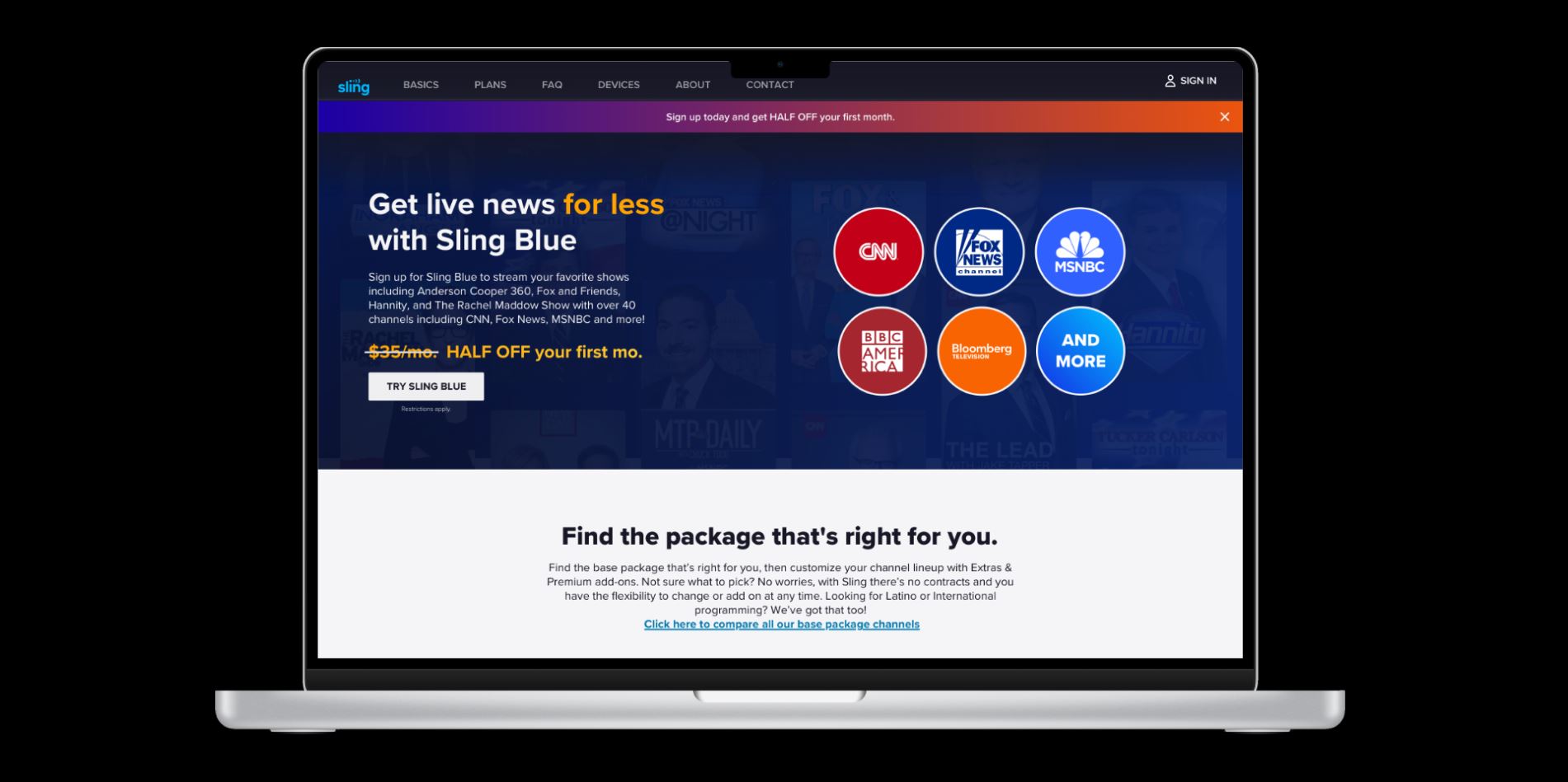
The Sling.com site is largely built around three main genre offerings: Sports, News, and Entertainment. The ask was to retool several of these pages which routinely get the most traffic (sports and news) to better serve high & low funnel visitors with the goal of increased cart conversions.
In Q3 of 2022, we formed a small team to handle this request consisting of myself, Alex Becknell, Steph Aziz, Heather Bettis (Creative Director), and Kim Mosberger (UX Researcher).
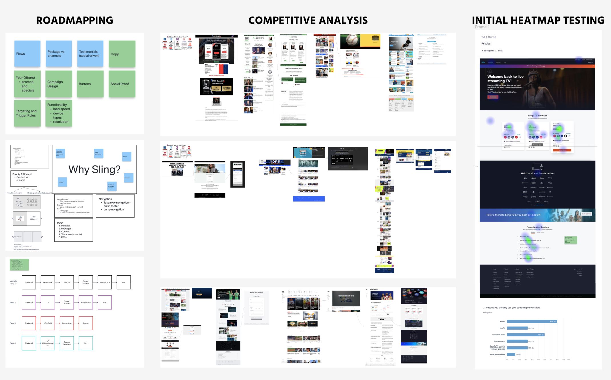
Initial brainstorms consisted of competitive analysis, analyzing the current user journey, and defining which variables could and/or should be modified.
Iteration Rounds
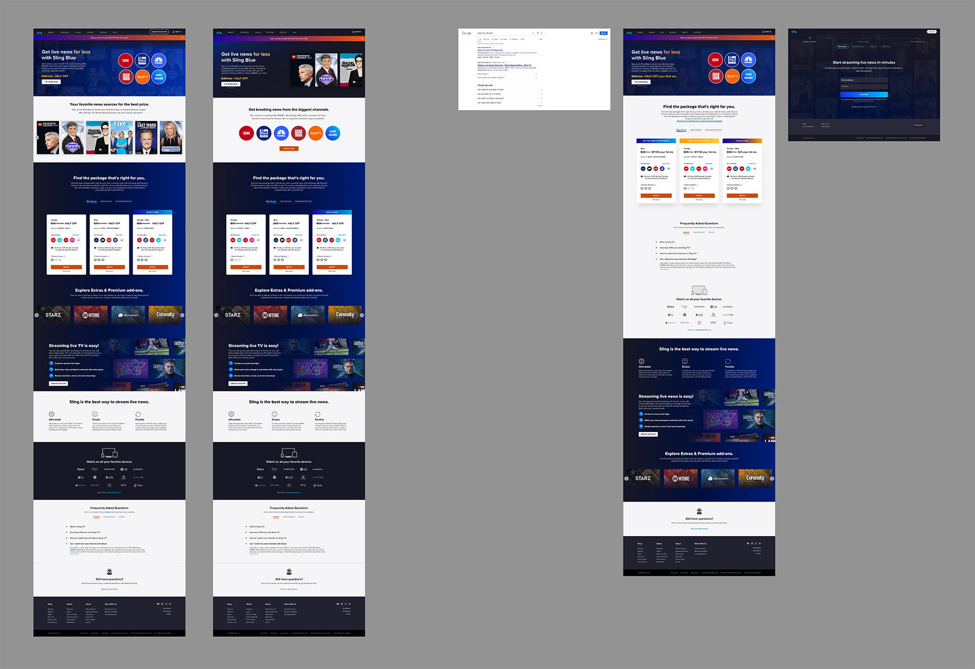
Initial exploration revealed that the existing landing pages may not have enough informational content for high-funnel visitors by the time they arrive in the cart. Hence, much of our ideation revolved around highlighting Sling’s product offerings to increase educational engagement while boosting the brand’s aesthetic personality with an improved page flow that felt more comprehensive and natural.
Our research methodology was a combination of first impression testing, heat maps, and verbatim recordings. Analyzing the live user journey made it possible to optimize the particular order of sections to best serve the funnel; achieving the balance by placing more service-oriented information up top (channel listings, package options, etc), and reserving the 2nd half of the flow for highlight features to be sure that the high-funnel traffic had enough educational info to enter the cart with confidence.
The division of design duties was split between each of the designers, with the News landing page being my focus. All design was completed in Sketch and presented through Invision, though the prototypes have since been translated into Figma due to an enterprise-wide migration during Q3 of 2023.
Landing Page Mockup Tools
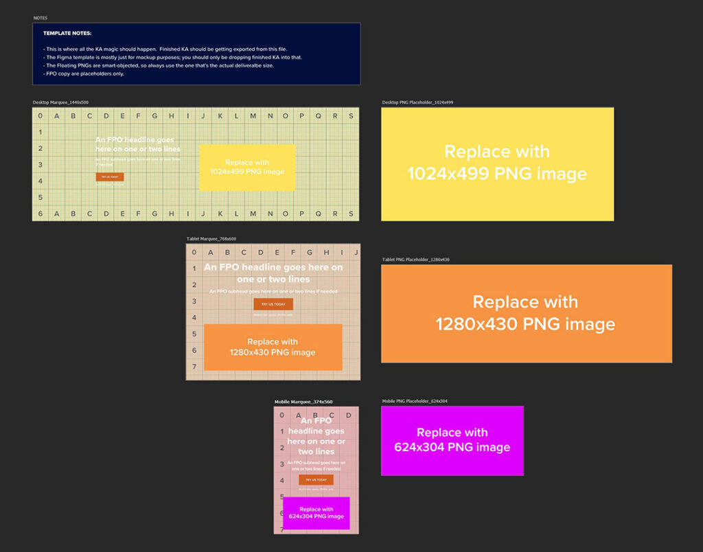
One of the issues we’ve been looking to solve for a long time is how to preview hero image assets accurately without having access to the Sling.com CMS. In a nutshell, we’d design the deliverables to the 3 spec sizes (desktop, tablet, and mobile), but once implemented, there would be cropping issues that we couldn’t account for due to poor documentation of the component DSM.
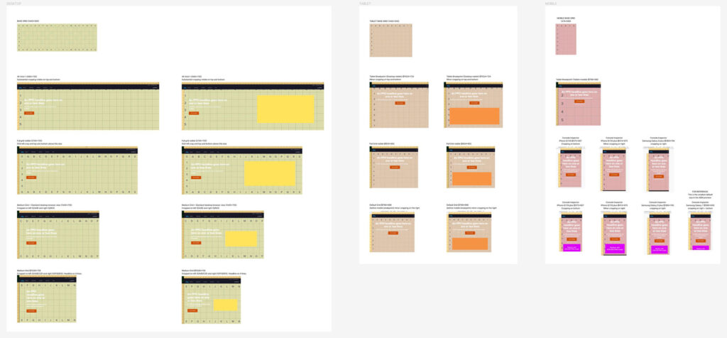
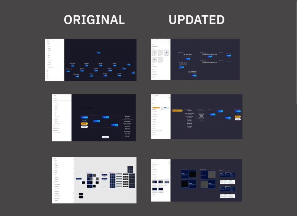
After gaining AEM authoring credentials, the next step was to map out how this component behaved. I achieved this by creating grid images in the 3x deliverable specs (desktop/tablet/mobile), inserting them into the CMS component, and then taking a series of screenshots at different viewport sizes to get an idea of how the cropping occurred in a responsive environment.
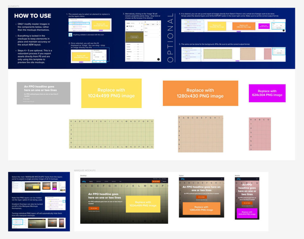
After surveying the cropping behavior, I created a hero image template in Photoshop (similar to the Sling Ad versioning templates) since most design work happens there initially, and then utilized Figma to construct a mockup tool with nested components.
The combination of these templates made it painless for designers without AEM access to create designs within the PS template, export the jpg images, and then preview them in Figma, if needed. This guarantees that designers are getting an accurate representation of how their design will appear live on the site, saving countless hours passing iterations on to the client who then passed them on to the AEM authors, only to be sent back due to cropping issues.
Email Template Library
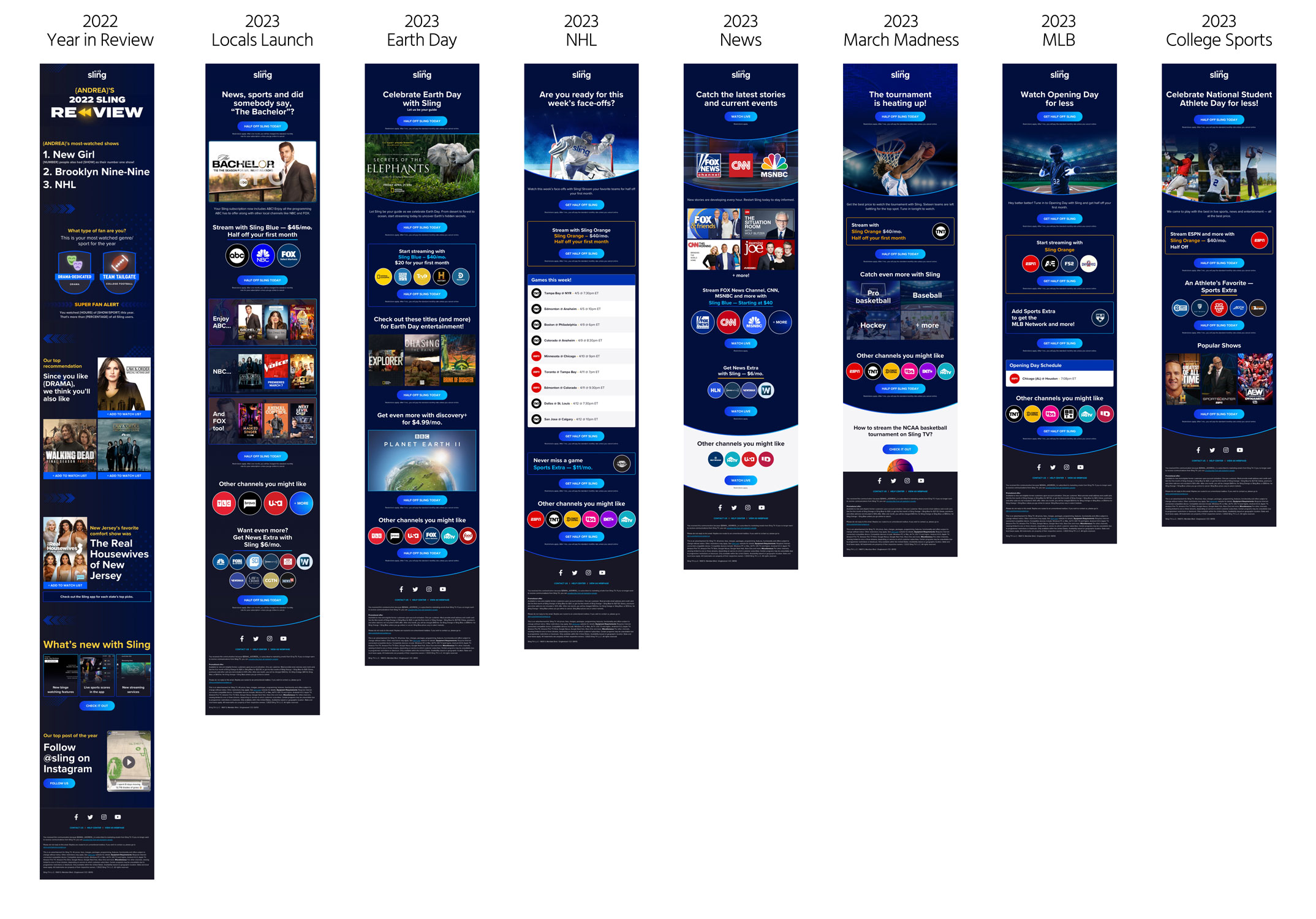
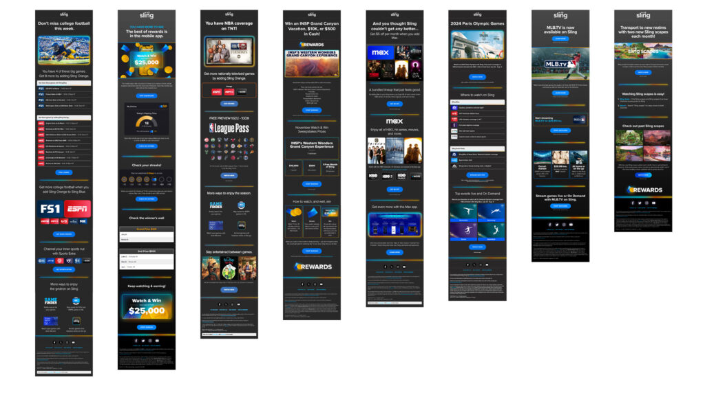
In 2021, we took on the substantial task of creating an email template library that catered to the different audience segmentation of recipients and types of emails being sent out. At a send rate of 15+ emails per week, it was crucial that this library be an easily accessible, customizable set of components that could be assembled quickly.
Overseeing a small team of 3 creatives, I directed the aesthetic treatment and pacing. Steph Aziz was the lead designer and is well-deserving of much credit for her many innovations and ability to work natively with the development team to translate designs into code.
Email Library Migration & Restructuring
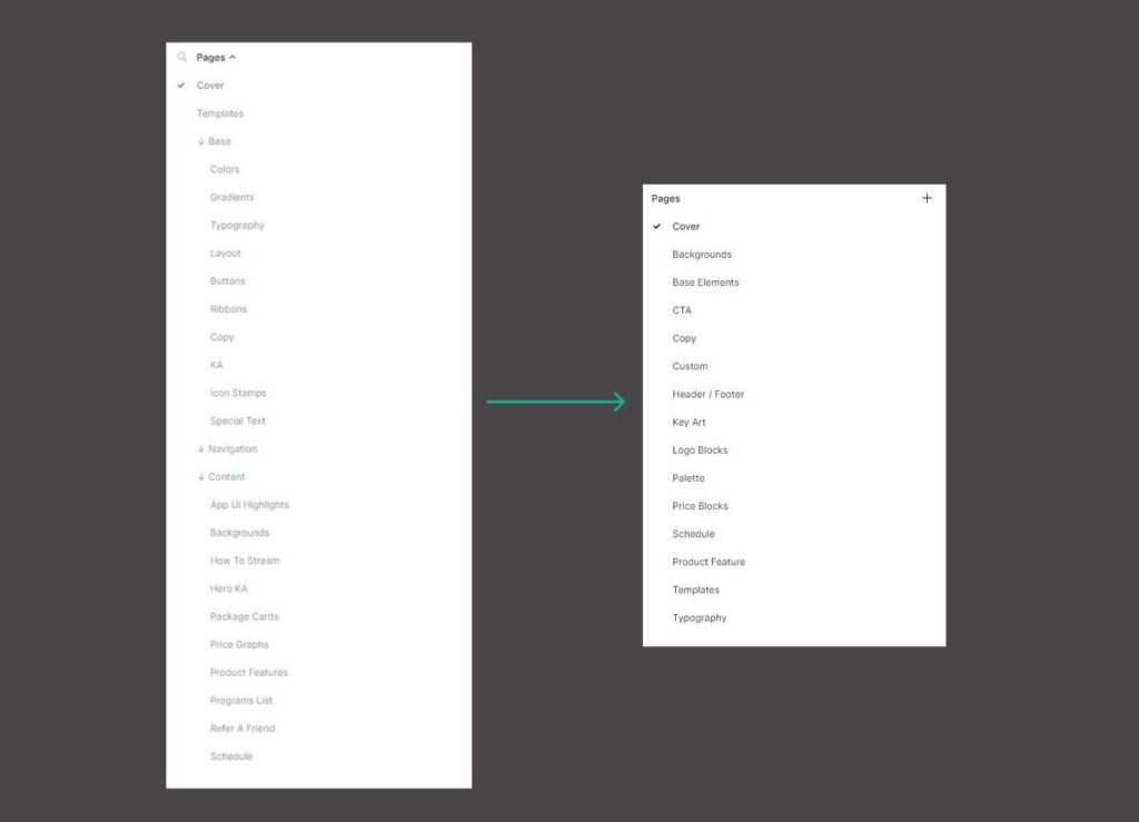
In August 2023, the enterprise initiated a company-wide shift from Sketch to Figma. While some of the email library could be imported, the translation isn’t usually without errors. During the transition, it became apparent that the library needed to be restructured to optimize for efficiency.
I first reorganized the library layering to be flatter, providing easier access to all pieces. Then I went through each set of components, recompiling many elements to be more user-friendly since the library ultimately needed to be approachable for anyone on the team to get in and start building with minimal orientation.
Each element was stress-tested by our email production team, who diligently documented any issues, allowing me to troubleshoot and make improvements wherever needed. Within a month, we were able to get the library completely imported into Figma, resolve all discrepancies, and seamlessly onboard other members of the team into the system.
Branding Refresh and Transition to Knak
With a branding refresh in Q1 2024, the email team decided to transition to the Knak platform for cost efficiency. This meant the mainstay library of module blocks was coded out and solidified within Knak, which came with clearly articulated best practices as defined by the dev team.
The benefit was two-fold, in that it helped in curtailing indecision and and experimental requests on the client side, while still allowing for custom design requests to be fulfilled in Figma on our end of the production chain. Oftentimes, a hybrid model provides the best compromise and such is the case with this arrangement.
RESULT
Both the landing page and email implementations have shown considerable impact, with statistically significant margins of improvement. Landing Page improvements have resulted in a 3% jump in conversions and a 10% drop in cart abandons, which amounts to an additional 22,500 subscribers out of the 750,000+ monthly visitors.
The templatization of the email library optimized the workflow, making it possible to intake and output a finished email in hours rather than days. Email improvements have shown relative performance increases as well, with 15% higher open rates across the board and dramatic improvement in current customer retention and former customer reactivations, driving substantial conversions for the business.
As anyone who has worked with design systems knows, libraries are organic things; constantly requiring maintenance and modifications. While those aspects will be ongoing, the restructuring of the library has made it more approachable for the whole agency, allowing designers with lower levels of Figma fluency to surmount the learning curve quickly with great benefit to overall productivity and the bottom line.
Implementing a hybrid approach with custom library blocks able to be blended seamlessly alongside Knak-coded modules achieves the best of both platforms, while boosting efficiency through less iteration time and more consistency. As the brand continues to evolve, we adapt processes in tandem to bring the most value to the business .
Ry has an innate ability to understand and address client needs effectively. He effortlessly maintains flexibility without compromising the high design standards of his team. Additionally, he consistently goes above and beyond to support his team, offering assistance and encouragement whenever needed.


